Introduction
Clear and effective data visualization plays a crucial role in making dashboards more intuitive and insightful. One common challenge in Salesforce Analytics (CRM Analytics) is ensuring that the colors used in donut and stacked bar charts are distinct enough to differentiate data segments easily. When colors are too similar, it can make interpretation difficult, reducing the overall effectiveness of the visual representation. Enhancing color contrast helps improve readability, supports accessibility, and enhances the user experience. In this blog, we’ll discuss best practices for optimizing color contrast in these chart types.
Why Colour Contrast Matters
1. Improves Accessibility
Users may struggle with low-contrast visuals. Enhancing contrast ensures data is clearly visible to a wider audience.
2. Enhances Data Clarity
When colours in charts are too similar, it can be difficult to distinguish between different segments. Using high-contrast colours makes data easier to analyse at a glance.
Best Practices for Enhancing Colour Contrast
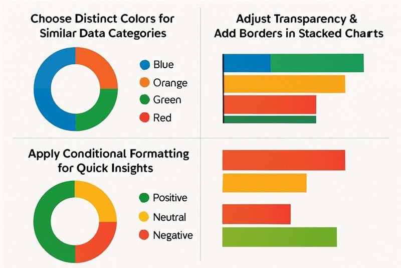
1. Choose Distinct Colors for Similar Data Categories
To make data categories easily distinguishable, avoid using multiple shades of the same color. Instead, select bold and contrasting colors that create a clear visual distinction between segments.
Best practice: Use contrasting colours such as blue, orange, green, and red.
Avoid: Multiple shades of the same colour, like light blue, medium blue, and dark blue.
2. Adjust Transparency & Add Borders in Stacked Bar Charts
When multiple data categories are stacked together, they can blend into one another. Adjusting transparency and adding borders can help improve clarity.
How to Adjust Transparency:
- Select the Stacked Bar Chart in your dashboard.
- Go to Chart Formatting.
- Lower the Transparency setting to enhance contrast.
- Enable Border Lines to create clear separations between segments.
3. Apply Conditional Formatting for Quick Insights
Salesforce Analytics allows you to use conditional formatting to highlight key data points with distinct colours. This makes it easier to identify trends at a glance.
Steps to Apply Conditional Formatting:
- Open the Lens or Dashboard.
- Select the Donut Chart or Stacked Bar Chart.
- Click on Conditional Formatting.
- Set rules such as:
- Green for positive trends
- Red for negative trends
- Yellow for neutral or warning values
- Apply and save changes.

Conclusion
Enhancing colour contrast in donut charts and stacked bar charts within Salesforce Analytics ensures better readability, accessibility, and usability. By using distinct colours, adjusting transparency, and leveraging conditional formatting, you can create visually compelling dashboards that provide clear and actionable insights.
Start optimizing your Salesforce Analytics charts today and elevate your data storytelling!


