In Salesforce, spotting key information quickly is crucial for maximizing productivity and making informed decisions. Conditional Formatting allows users to dynamically highlight specific fields based on predefined rules, making vital data points easily visible. This feature enhances user experience by drawing attention to important information without the need for extensive searches.
Why Conditional Formatting Matters for End Users
Improved Data Clarity: End users can quickly identify critical information, reducing the time spent scanning through records.
Quicker Insights: Important updates like high-value opportunities or urgent cases are immediately visible, enabling users to take action faster.
Streamlined Workflows: By highlighting key fields, users can focus on tasks that require their immediate attention, boosting overall efficiency.
How to Use Conditional Formatting Effectively
- Identify Key Fields: Select fields with important information for users, such as “Opportunity Amount” or “Case Status.”
- Set Criteria for Highlighting: Define clear rules for when fields should be highlighted. For example, use red to indicate overdue tasks or green for high-priority leads.
- Choose Visual Cues: Use colour coding, icons, or bold text to differentiate important fields and make them stand out.
- Implement Using Salesforce Tools: Utilize Lightning App Builder, Flow Builder, or Reports & Dashboards to apply these formatting rules with ease.
- Test for User Experience: Ensure the formatting is user-friendly and consistent across devices.
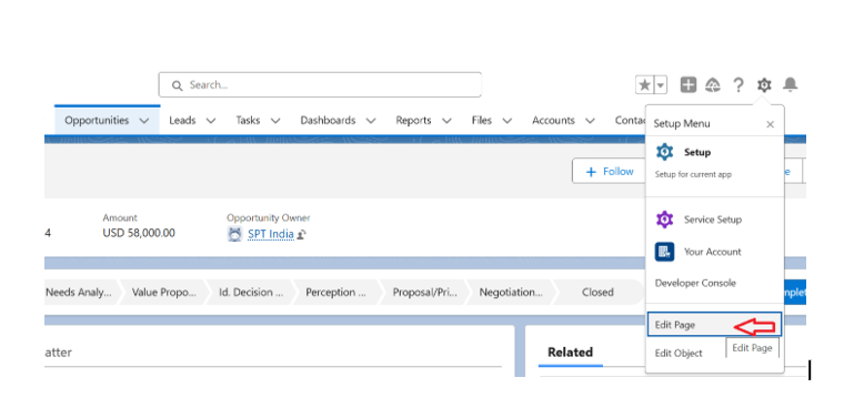
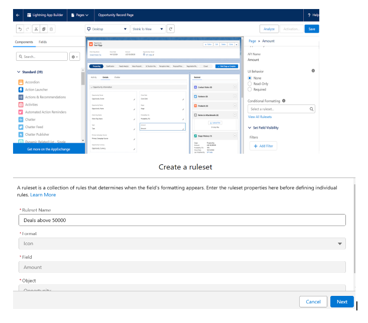
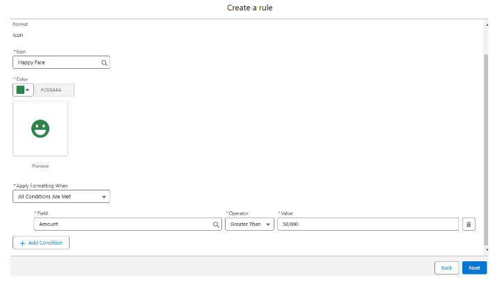
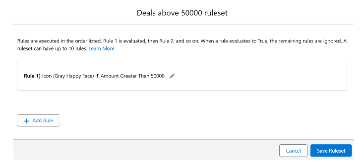
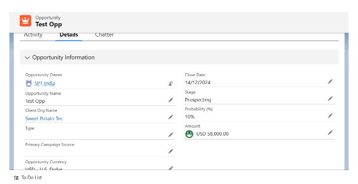
Examples of Conditional Formatting in Action
- Sales Teams: Highlight high-value opportunities (e.g., deals over $50K) in green, allowing sales reps to focus on the most lucrative prospects.
- Support Teams: Flag overdue cases in red, making it easier for support agents to prioritize and resolve urgent issues.
- Project Management: Display warning icons for overdue milestones, enabling project managers to address delays promptly.
Best Practices for End Users
- Keep It Clear: Use formatting sparingly to avoid overwhelming users with too many visual cues.
- Consider Accessibility: Choose color schemes and icons that are easily distinguishable for all users, including those with color vision deficiencies.
- Test Across Devices: Ensure the highlighted fields are easily recognizable on both desktop and mobile views.
The Future of Conditional Formatting
As Salesforce continues to integrate AI capabilities, we can expect enhancements like predictive highlighting that proactively draws attention to fields based on user behavior and trends. This will make Conditional Formatting even more tailored and effective for end users.
Conclusion
Conditional Formatting in Salesforce is a powerful tool that enhances the user experience by bringing critical information to the forefront. By helping users focus on what matters most, it boosts productivity, speeds up decision-making, and ensures timely action. Enable this feature today to optimize your Salesforce experience and empower your team.

